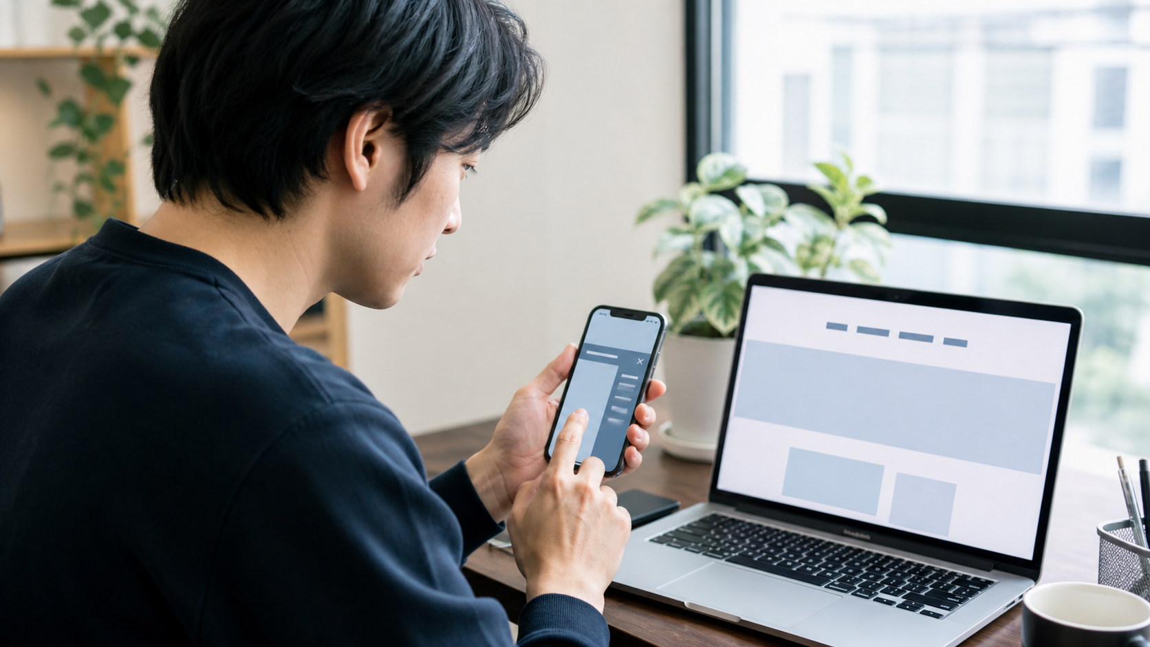
スマートフォンでは横幅が狭いため、パソコン用のメニューをそのまま並べると文字が重なったり、画面外にはみ出したりします。ハンバーガーメニューを使えば、必要なときだけナビゲーションを開いて表示できます。
ただし、見た目だけ三本線にしたボタンでは、キーボード操作や読み上げに対応できないことがあります。本記事では、HTML・CSS・JavaScriptで基本的な操作性を備えたメニューを作ります。
ハンバーガーメニューの基本構造
ヘッダー内にロゴ、開閉ボタン、ナビゲーションを用意します。
<header class="site-header">
  <a class="site-logo" href="/">サイト名</a>

  <button
    class="menu-button"
    type="button"
    aria-expanded="false"
    aria-controls="global-menu"
    aria-label="メニューを開く"
  >
    <span></span>
    <span></span>
    <span></span>
  </button>

  <nav id="global-menu" class="global-menu">
    <a href="/service/">サービス</a>
    <a href="/price/">料金</a>
    <a href="/contact/">お問い合わせ</a>
  </nav>
</header>aria-controlsで操作対象を示し、aria-expandedで現在開いているかを伝えます。
パソコン用のCSSを設定する
.site-header {
  display: flex;
  min-height: 72px;
  align-items: center;
  justify-content: space-between;
  gap: 24px;
  padding: 0 24px;
  background: #fff;
  border-bottom: 1px solid #e3e8ec;
}

.site-logo {
  color: #17324a;
  font-weight: 800;
  text-decoration: none;
}

.global-menu {
  display: flex;
  align-items: center;
  gap: 24px;
}

.global-menu a {
  color: #243746;
  text-decoration: none;
}

.menu-button {
  display: none;
}
パソコンではメニューを横並びにし、開閉ボタンは非表示にします。
スマートフォン用CSSへ切り替える
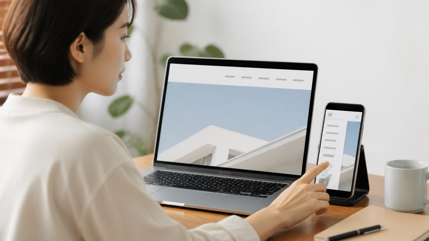
@media (max-width: 768px) {
  .site-header {
    position: relative;
    padding: 0 16px;
  }

  .menu-button {
    display: grid;
    width: 44px;
    height: 44px;
    place-content: center;
    gap: 5px;
    border: 0;
    background: transparent;
    cursor: pointer;
  }

  .menu-button span {
    display: block;
    width: 26px;
    height: 2px;
    background: #17324a;
  }

  .global-menu {
    position: absolute;
    top: 100%;
    right: 0;
    left: 0;
    z-index: 1000;
    display: none;
    padding: 12px 16px 20px;
    background: #fff;
    box-shadow: 0 8px 18px rgba(0, 0, 0, .12);
  }

  .global-menu.is-open {
    display: grid;
  }

  .global-menu a {
    padding: 14px 4px;
    border-bottom: 1px solid #e8edf0;
  }
}
ボタンは最低44px程度の操作領域を確保し、メニューリンクも指で押しやすい余白にします。
JavaScriptで開閉状態を切り替える
const menuButton = document.querySelector('.menu-button');
const globalMenu = document.getElementById('global-menu');

menuButton.addEventListener('click', () => {
  const isOpen = menuButton.getAttribute('aria-expanded') === 'true';

  menuButton.setAttribute('aria-expanded', String(!isOpen));
  menuButton.setAttribute(
    'aria-label',
    isOpen ? 'メニューを開く' : 'メニューを閉じる'
  );
  globalMenu.classList.toggle('is-open', !isOpen);
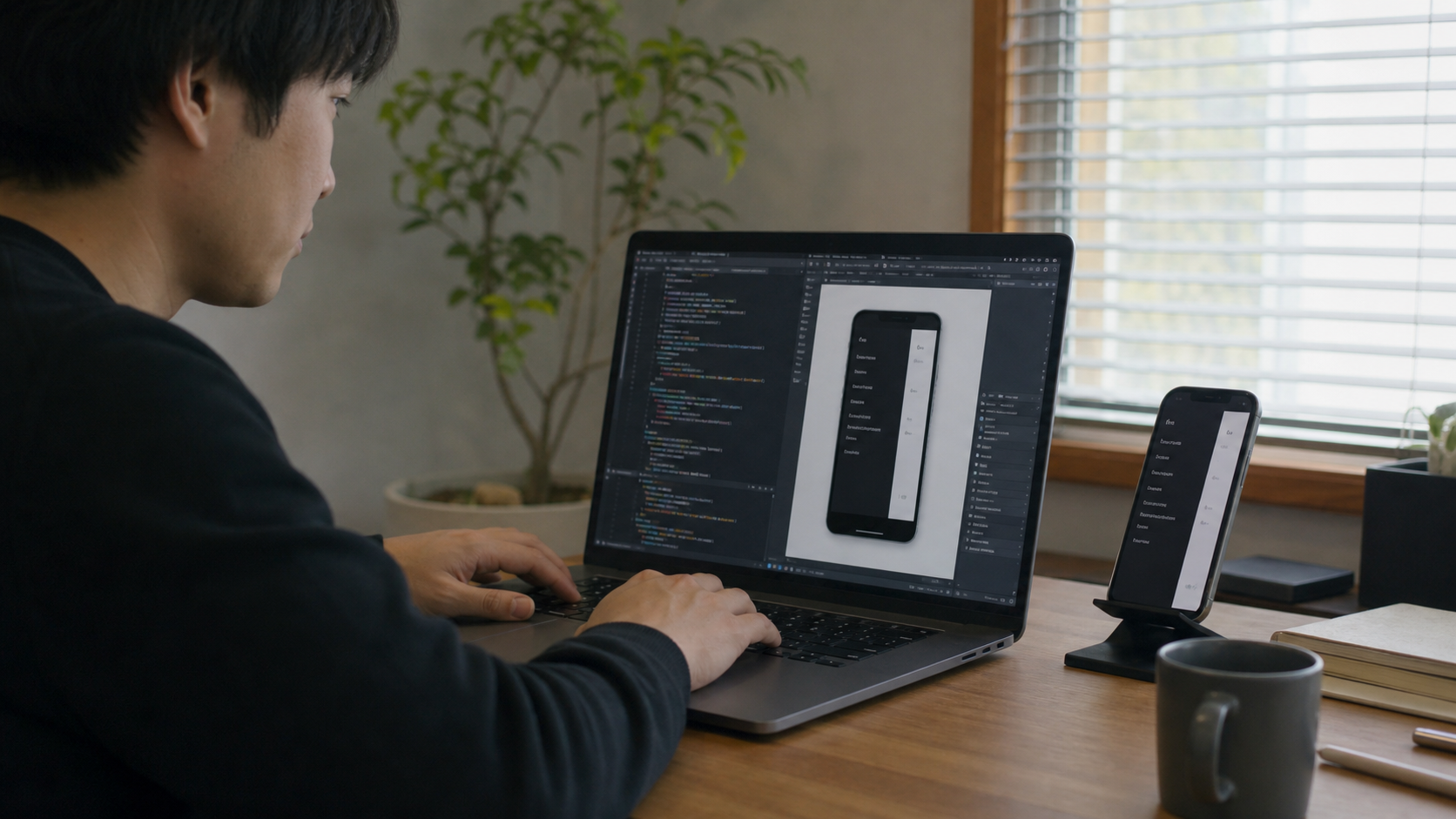
});見た目のクラスだけでなく、aria-expandedとボタン名も同時に更新します。
Escapeキーでも閉じられるようにする
document.addEventListener('keydown', (event) => {
  if (event.key !== 'Escape') return;
  if (menuButton.getAttribute('aria-expanded') !== 'true') return;

  menuButton.setAttribute('aria-expanded', 'false');
  menuButton.setAttribute('aria-label', 'メニューを開く');
  globalMenu.classList.remove('is-open');
  menuButton.focus();
});
キーボードで閉じたあと、フォーカスを開閉ボタンへ戻します。
リンクを押したらメニューを閉じる
globalMenu.querySelectorAll('a').forEach((link) => {
  link.addEventListener('click', () => {
    menuButton.setAttribute('aria-expanded', 'false');
    menuButton.setAttribute('aria-label', 'メニューを開く');
    globalMenu.classList.remove('is-open');
  });
});
ページ内リンクを使う場合も、移動後にメニューが画面を覆い続けるのを防げます。
設置後の確認項目
- スマートフォン幅だけ開閉ボタンが表示されるか
- ボタンとリンクを指で押しやすいか
- キーボードのTabキーで操作できるか
- Escapeキーで閉じられるか
- メニューが本文や管理バーの後ろに隠れないか
- 画面幅を切り替えても表示状態が崩れないか
まとめ
ハンバーガーメニューは、省スペースだけでなく操作性も考えて実装します。ボタン要素、開閉状態、キーボード操作、押しやすい余白を用意し、実際のスマートフォンで確認しましょう。




コメント